chickadee lab
traditional class meets digital edge
chickadee lab is a vietnamese digital team driven by a firm belief: world-class digital solutions don’t have to come from beyond vietnam’s borders. with immense talent, cultural insight, and creativity, they are setting a new standard from within.
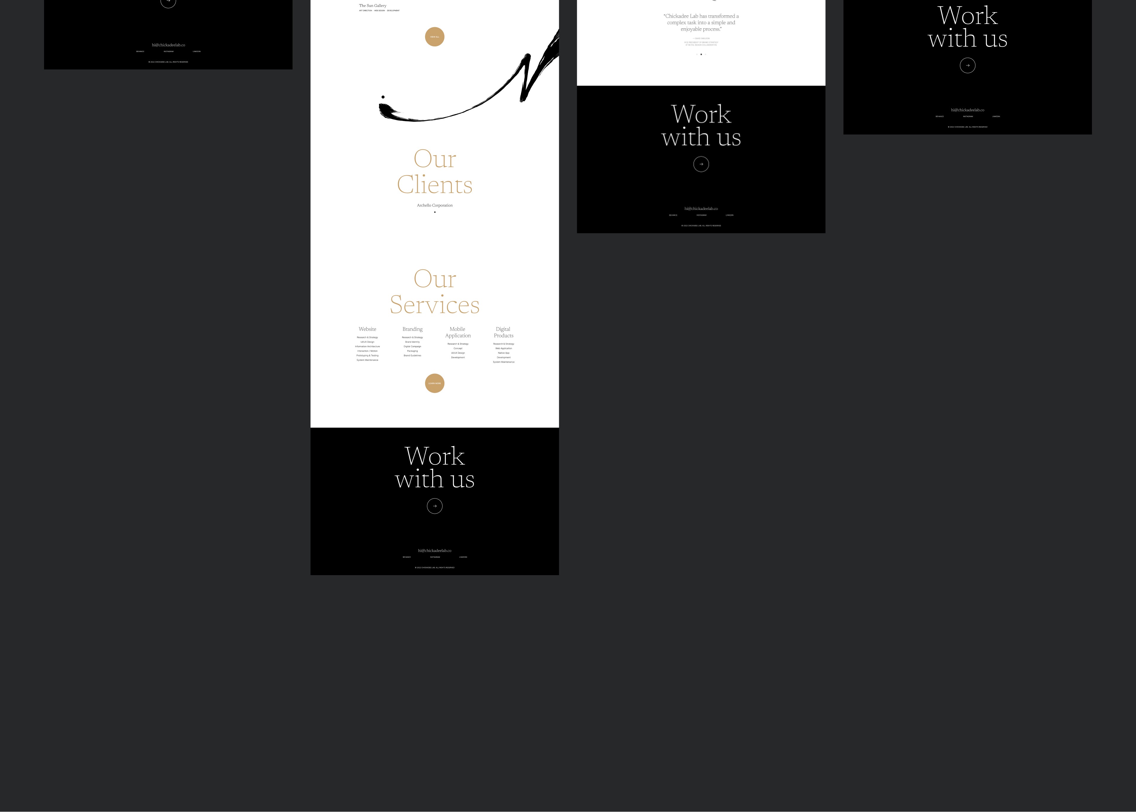
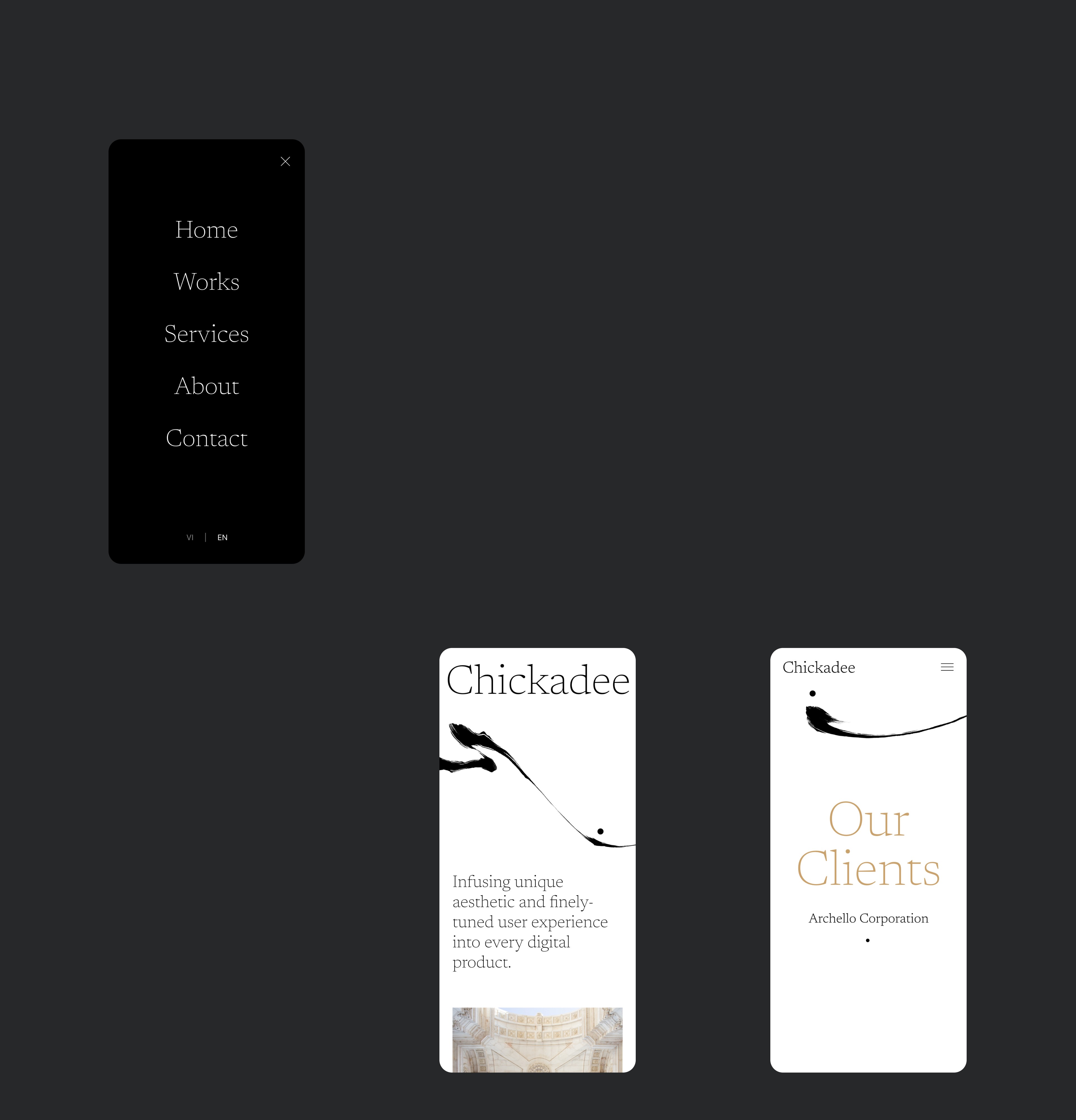
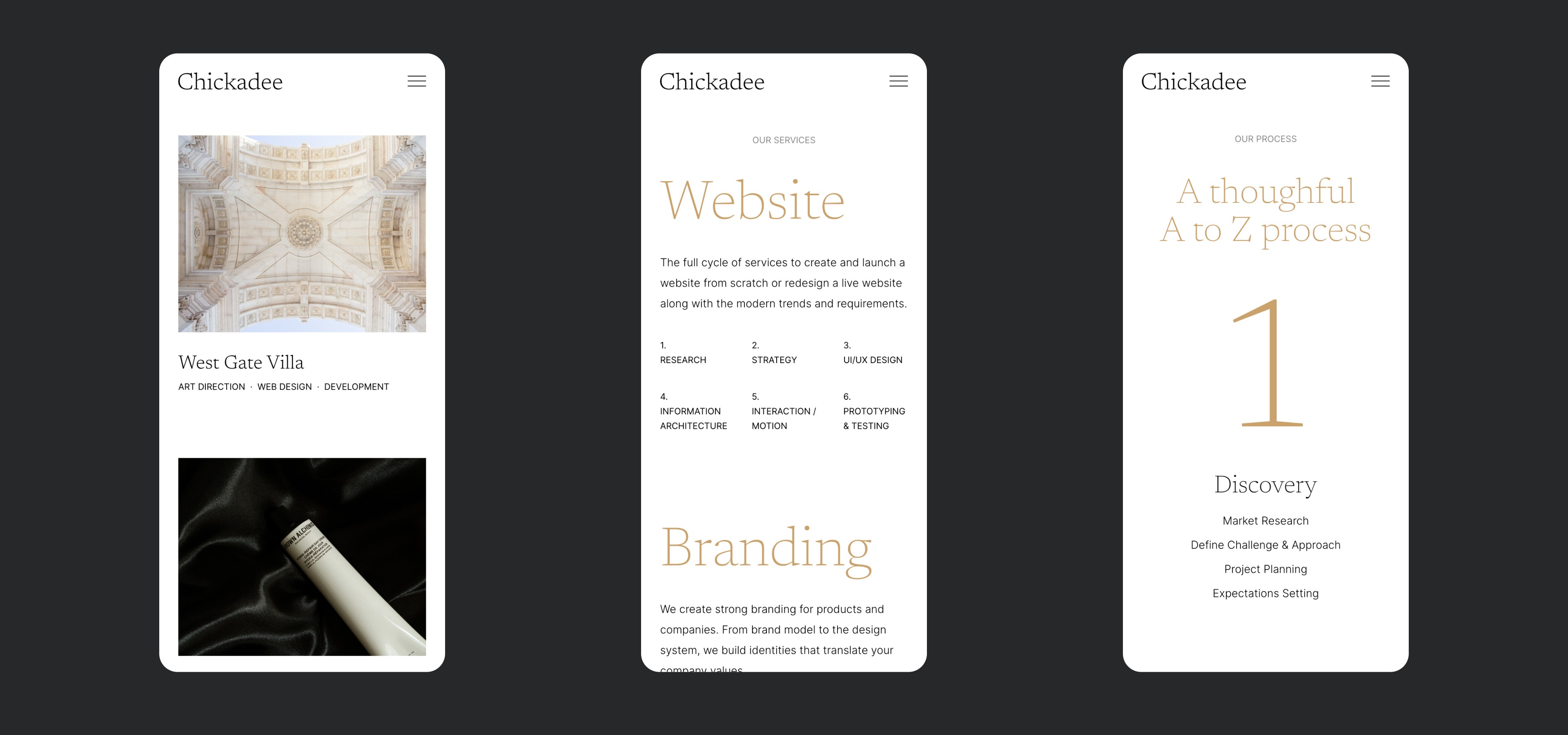
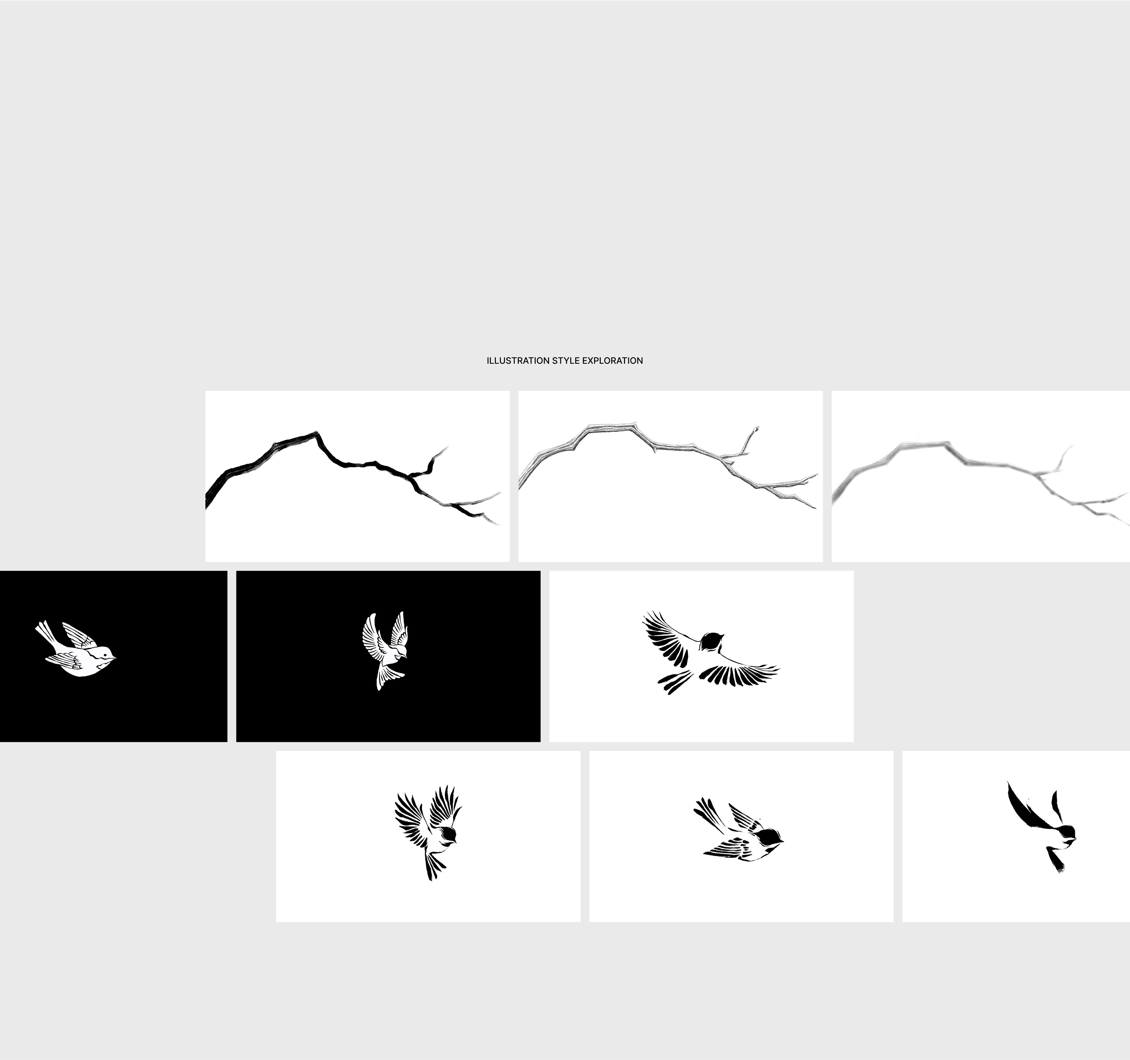
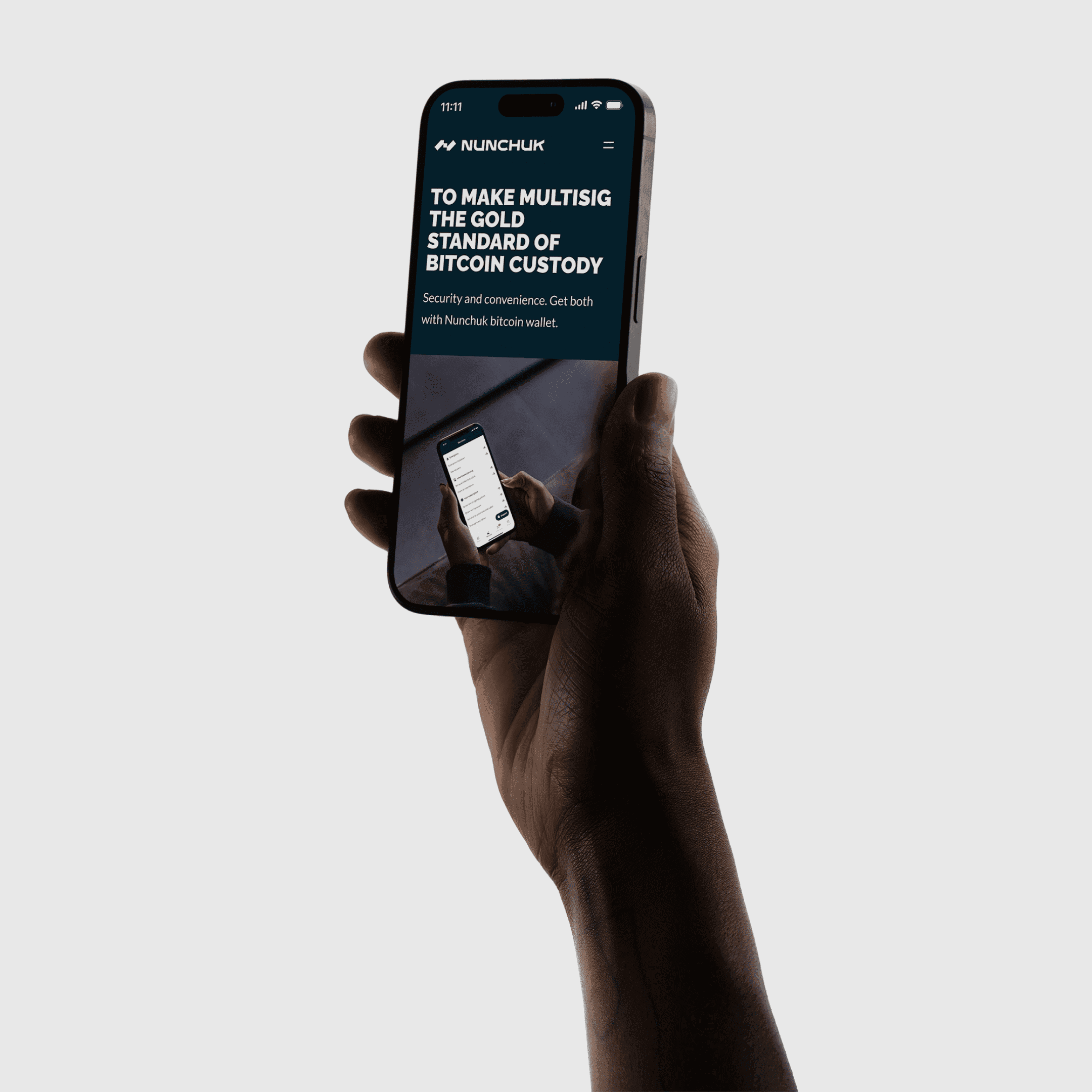
as chickadee lab set its sights on high-profile clients, we defined “classic elegance” as the core concept. the team sought an exclusive sophistication—a refined balance of cultural artistry and thoughtful curation with a clever twist to showcase their work.
year
2022
scope
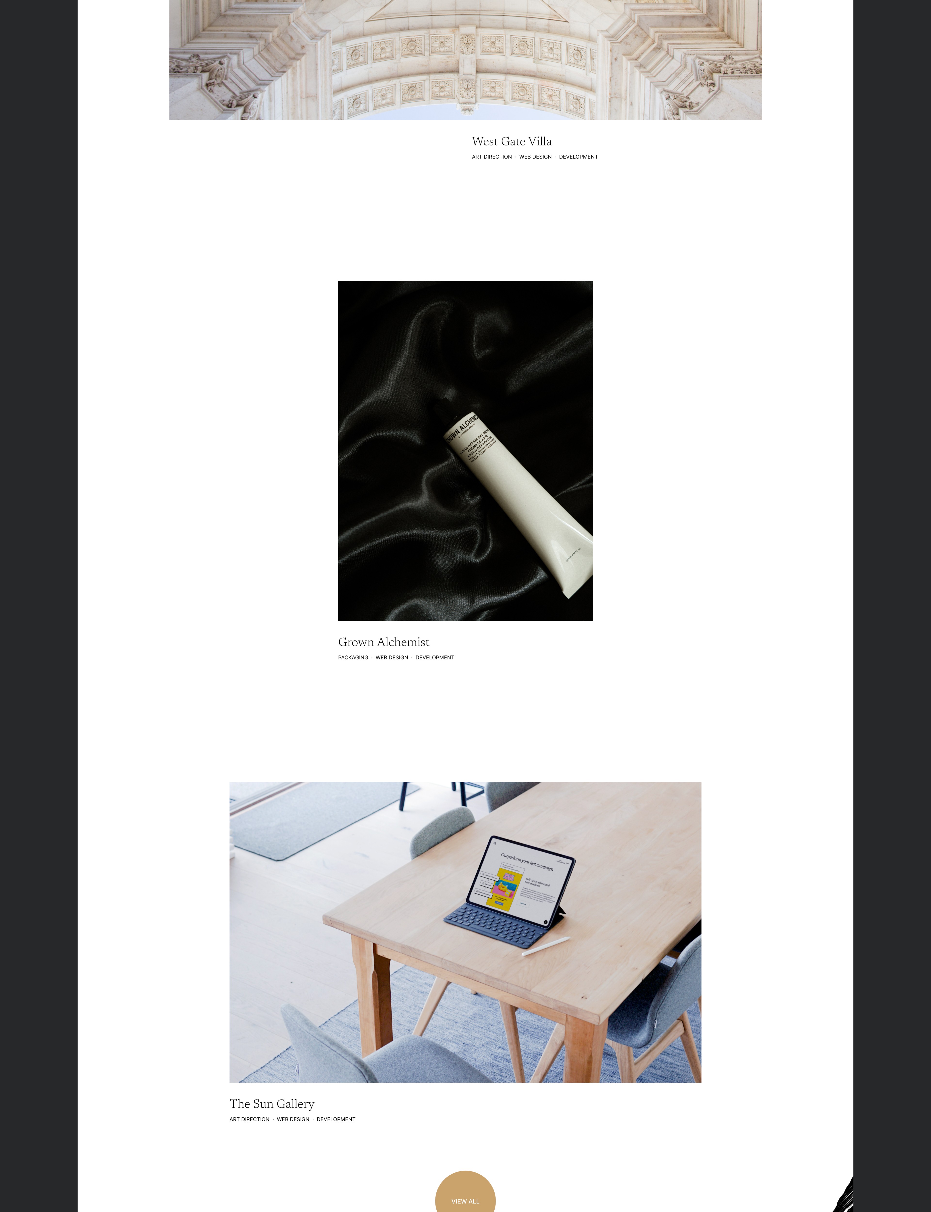
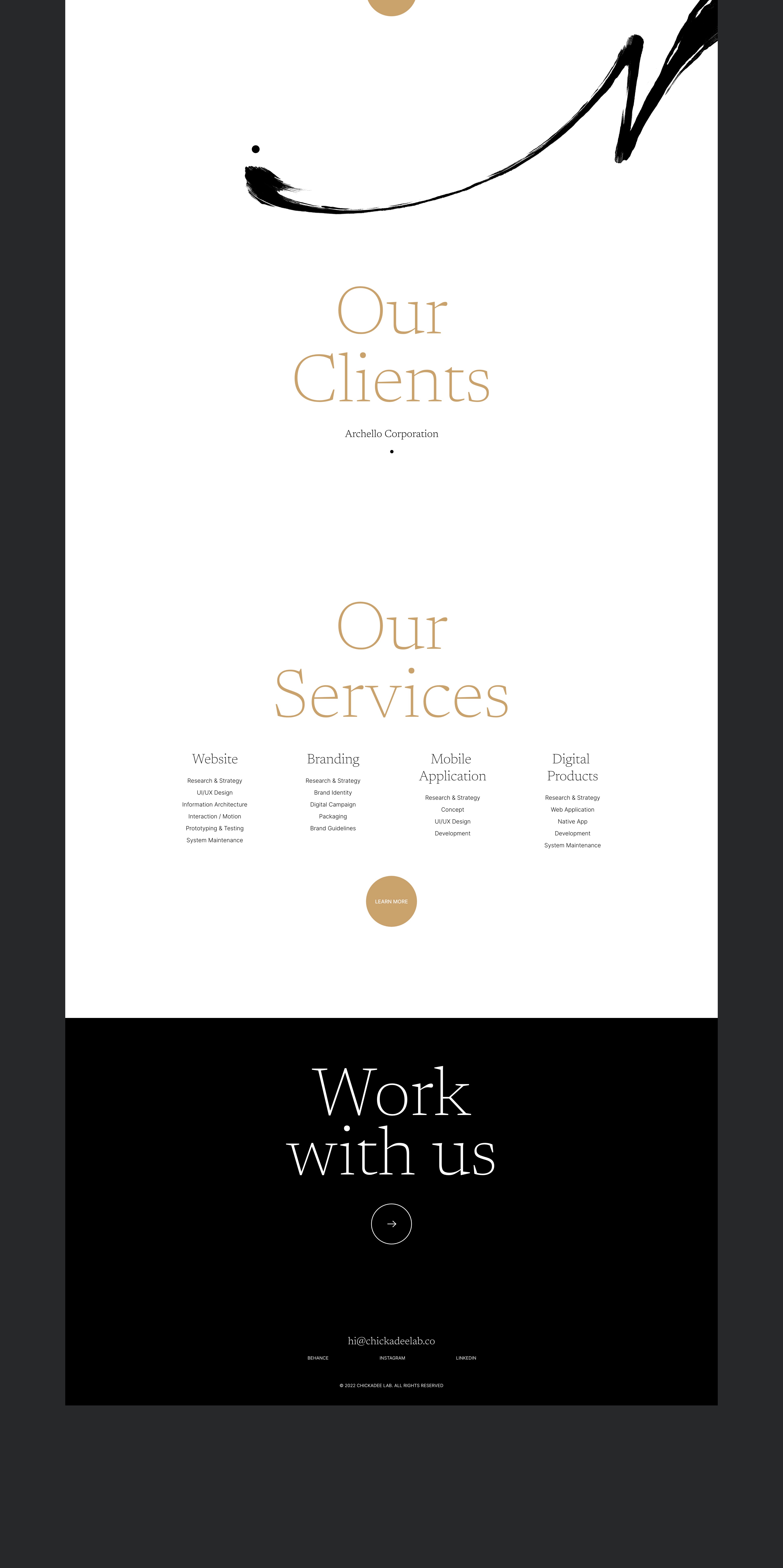
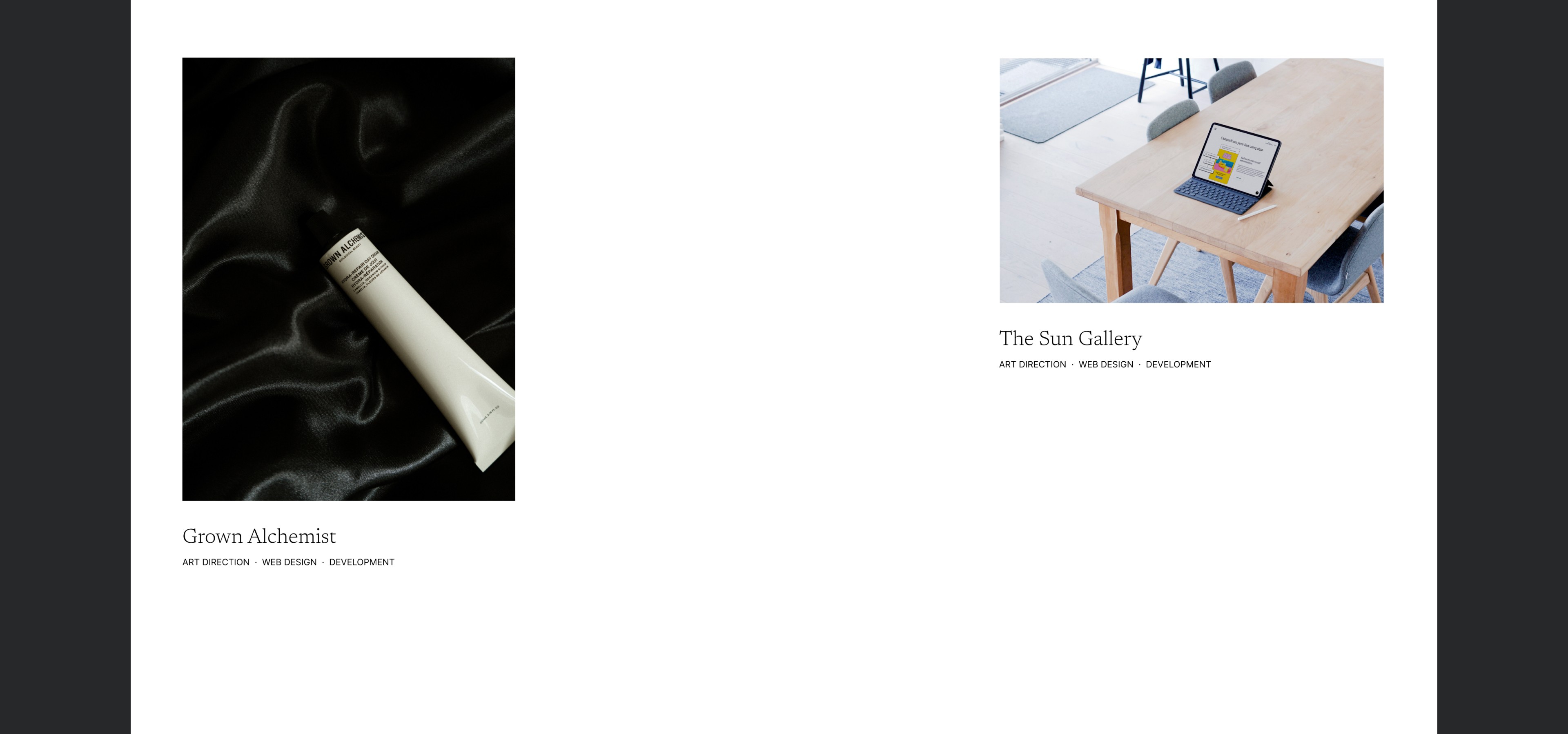
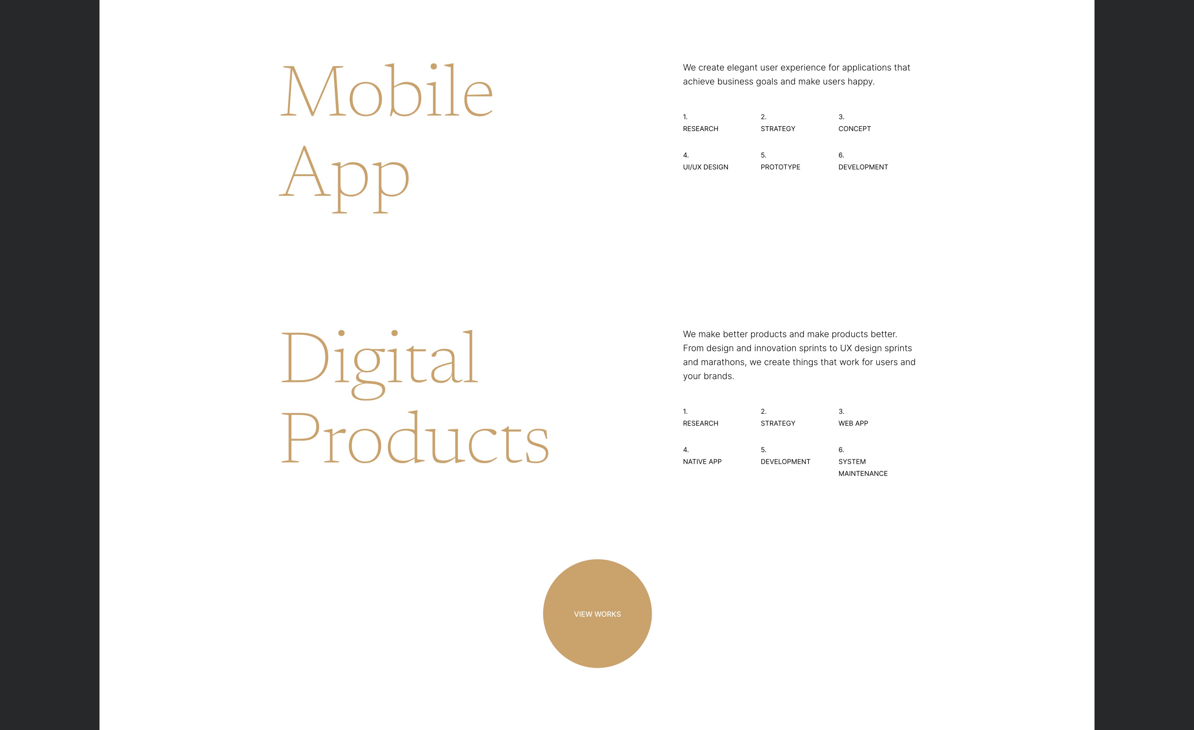
brand identity / web design
client
chickadee lab


the concept
chickadee lab takes its name from the chickadee—a small yet bold north american songbird known for its curiosity, friendliness, and intricate communication. this spirit mirrors the team’s vision: a sharp, agile, insightful collective of talents delivering culturally rich, smart, and impactful design.


typography
newsreader was chosen as the main typeface for its modern, timeless elegance; a nod to the cool, open north american landscapes where chickadees make their year-round home. this carefully selected typeface establishes a refined, minimal tone for the portfolio. as an open-source google font, it’s lightweight yet impactful, perfectly capturing the brand’s spirit without the need for a custom typeface.
illustrative elements
taking cues from the chickadee’s distinct black cap, eastern ink art techniques was employed to illustrate decorative branches, weaving cultural texture into the portfolio.
illustrative elements
taking cues from the chickadee’s distinct black cap, eastern ink art techniques was employed to illustrate decorative branches, weaving cultural texture into the portfolio.
illustrative elements
taking cues from the chickadee’s distinct black cap, eastern ink art techniques was employed to illustrate decorative branches, weaving cultural texture into the portfolio.
visual twist
for a visual twist, i created a clean loading animation at the first site’s entry: the chickadee transforms into a minimal dot, which then reappears as a recurring motif across the site, bringing a layer of storytelling and elegance without burdening the site’s load.
visual twist
for a visual twist, i created a clean loading animation at the first site’s entry: the chickadee transforms into a minimal dot, which then reappears as a recurring motif across the site, bringing a layer of storytelling and elegance without burdening the site’s load.
visual twist
for a visual twist, i created a clean loading animation at the first site’s entry: the chickadee transforms into a minimal dot, which then reappears as a recurring motif across the site, bringing a layer of storytelling and elegance without burdening the site’s load.
more works
©2025 vy mai. all rights reserved

