maison wecraft

a gallery for the times

maison wecraft is a singapore-based gallery and platform for contemporary craft, created at the intersection of artisanal heritage and the modern world. guided by manu factum — made by hand — the brand champions the enduring value of human touch, imagination, and craftsmanship in an age increasingly shaped by automation.

*this case study outlines the independent design strategy and conceptual framework developed for maison wecraft. all photography featured is used for visual mockup purposes only and does not represent official imagery from maison wecraft.

year

2025

scope

brand identity / web design

client

wecraft group

the house of craft

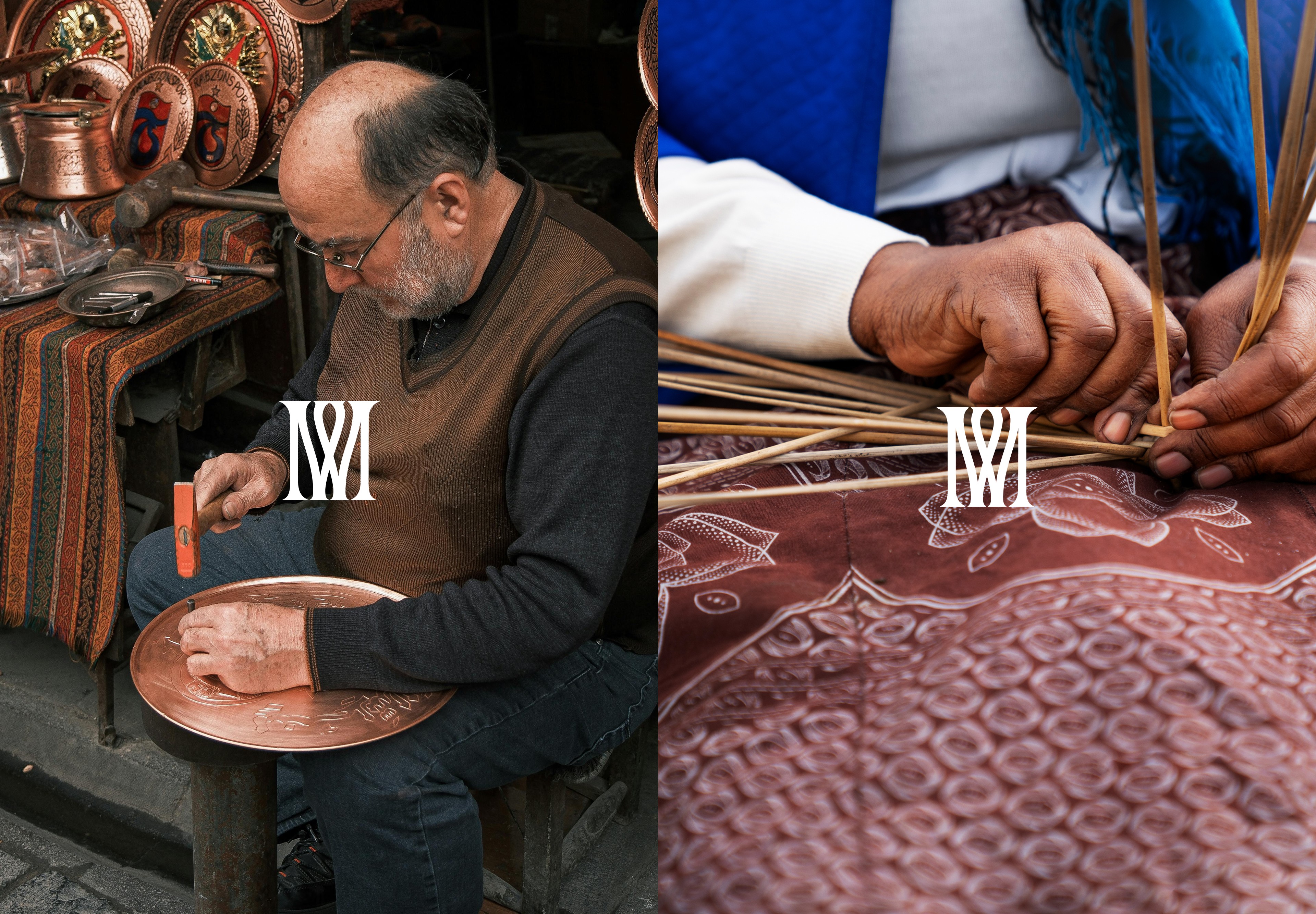
conceived as a space for discovering contemporary heirlooms, maison wecraft brings together master artisans, material innovation, and refined living. each piece is valued not only for its function, but for the story, patience, and savoir-faire embedded in its making.

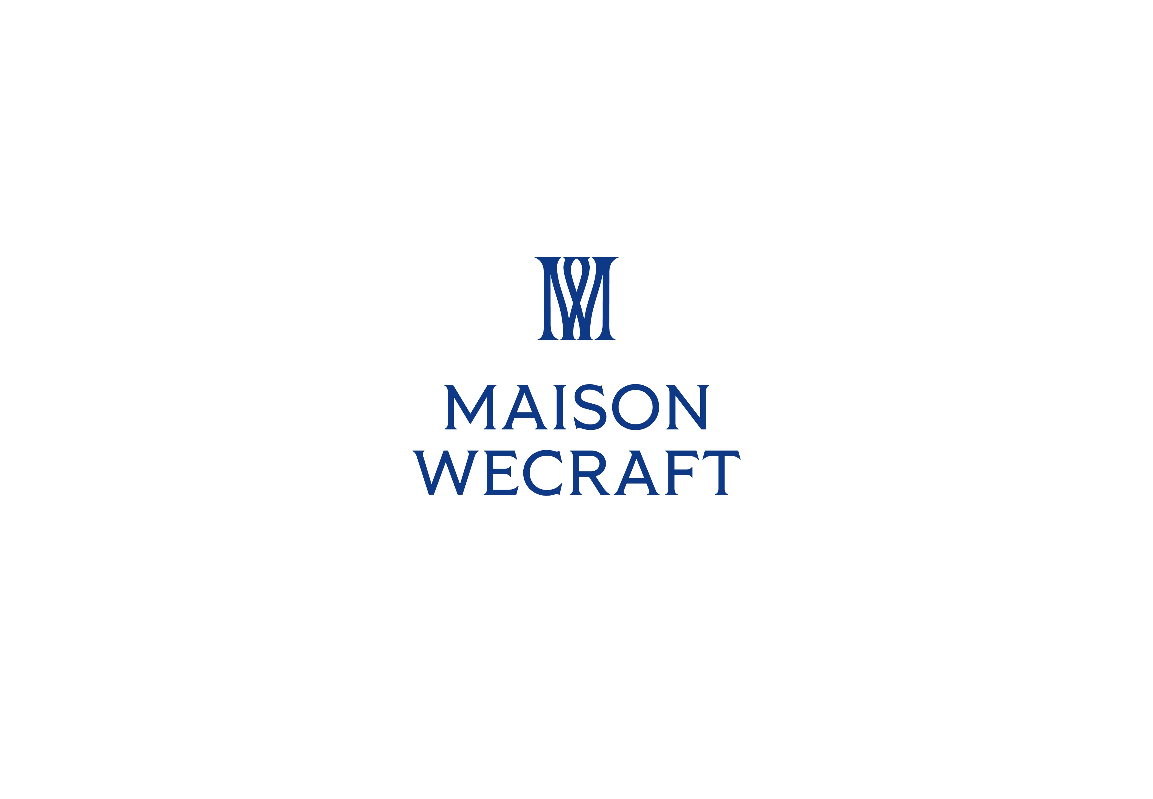
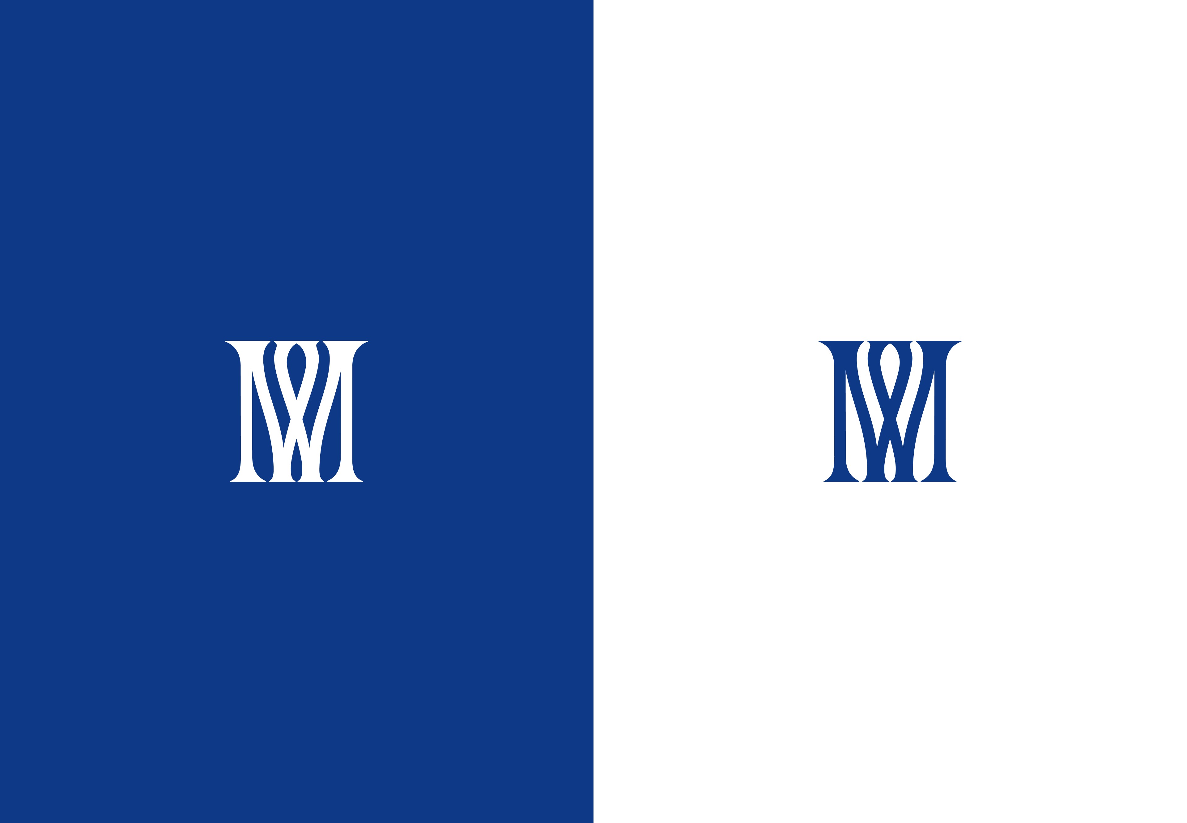
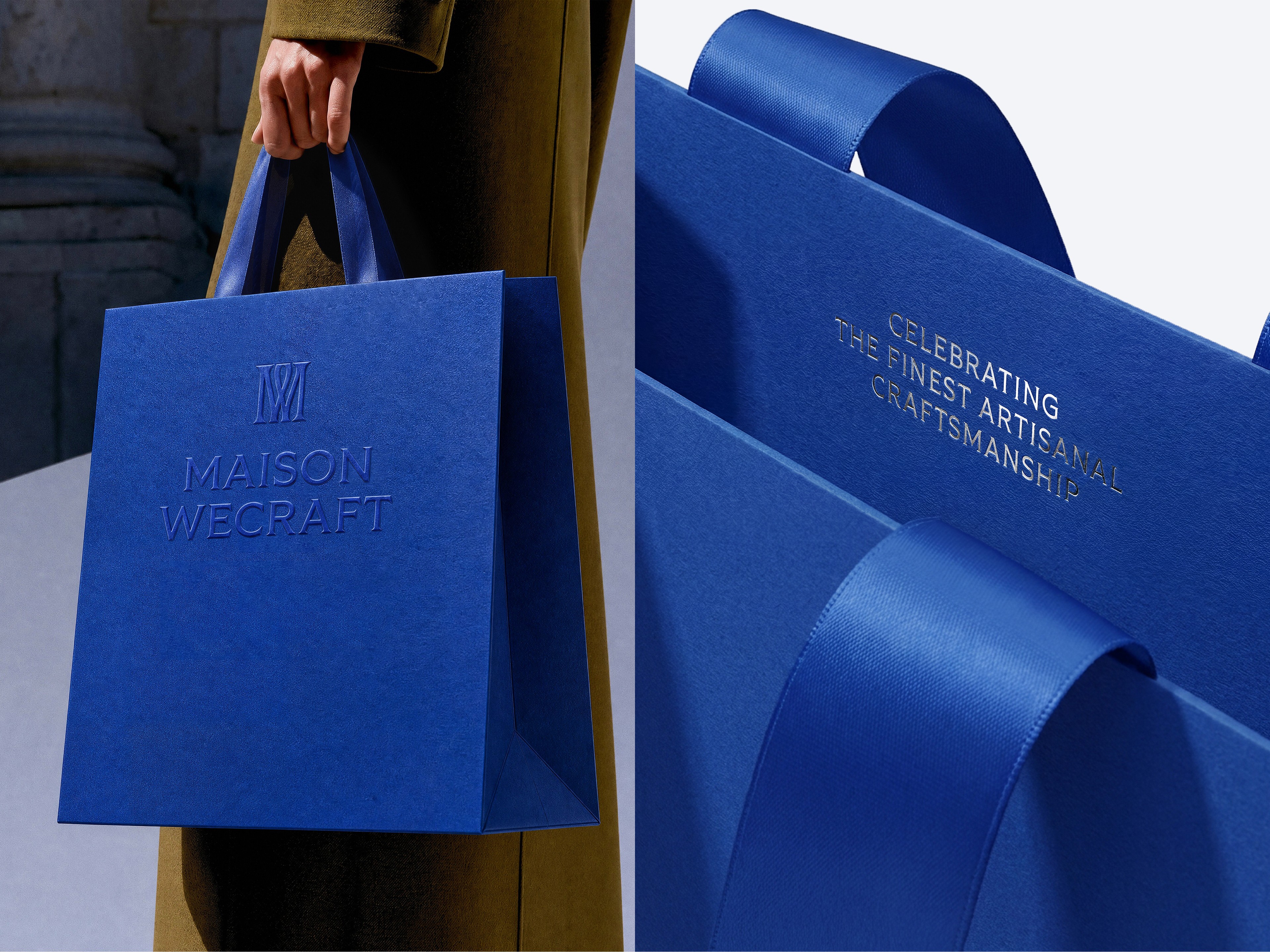
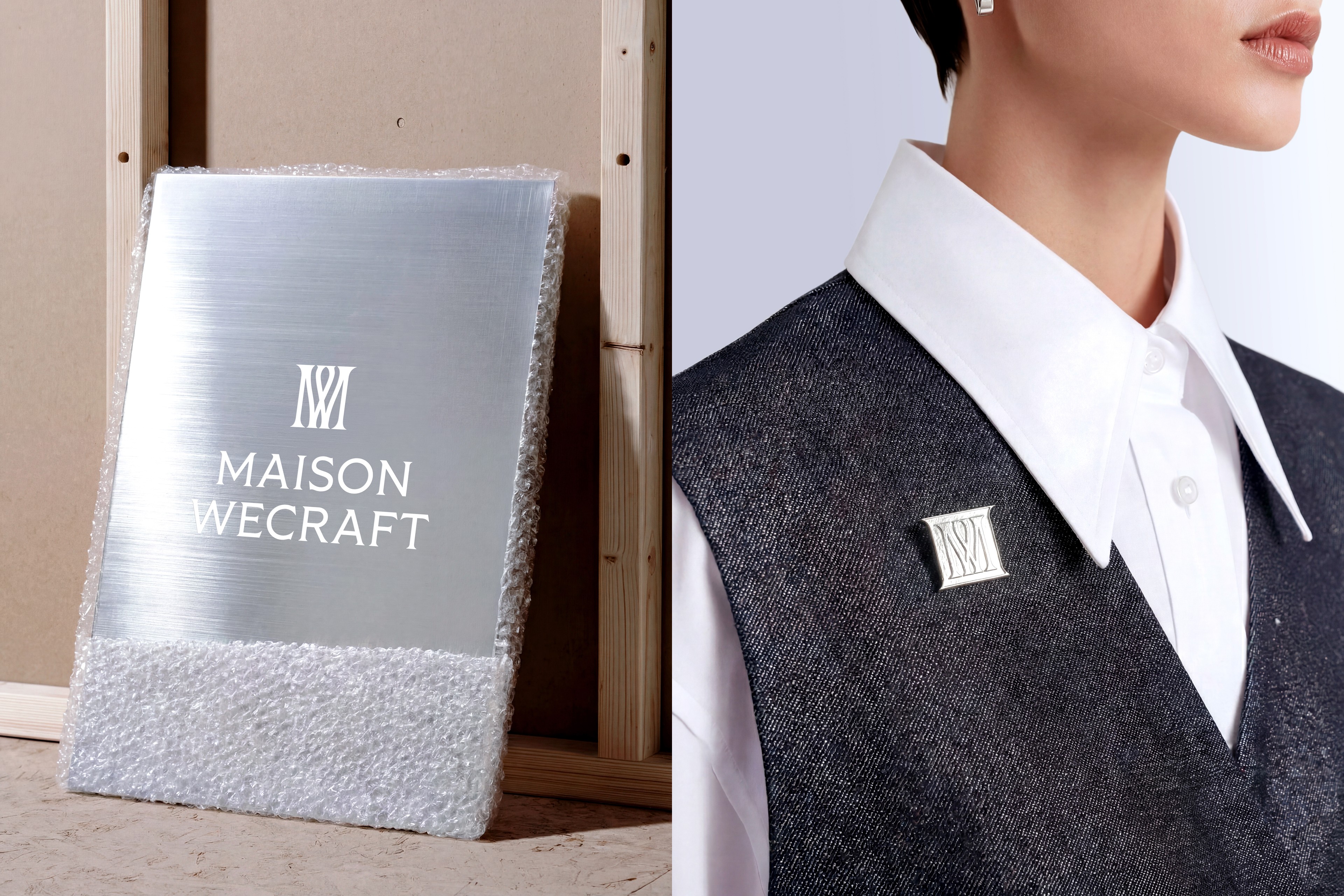
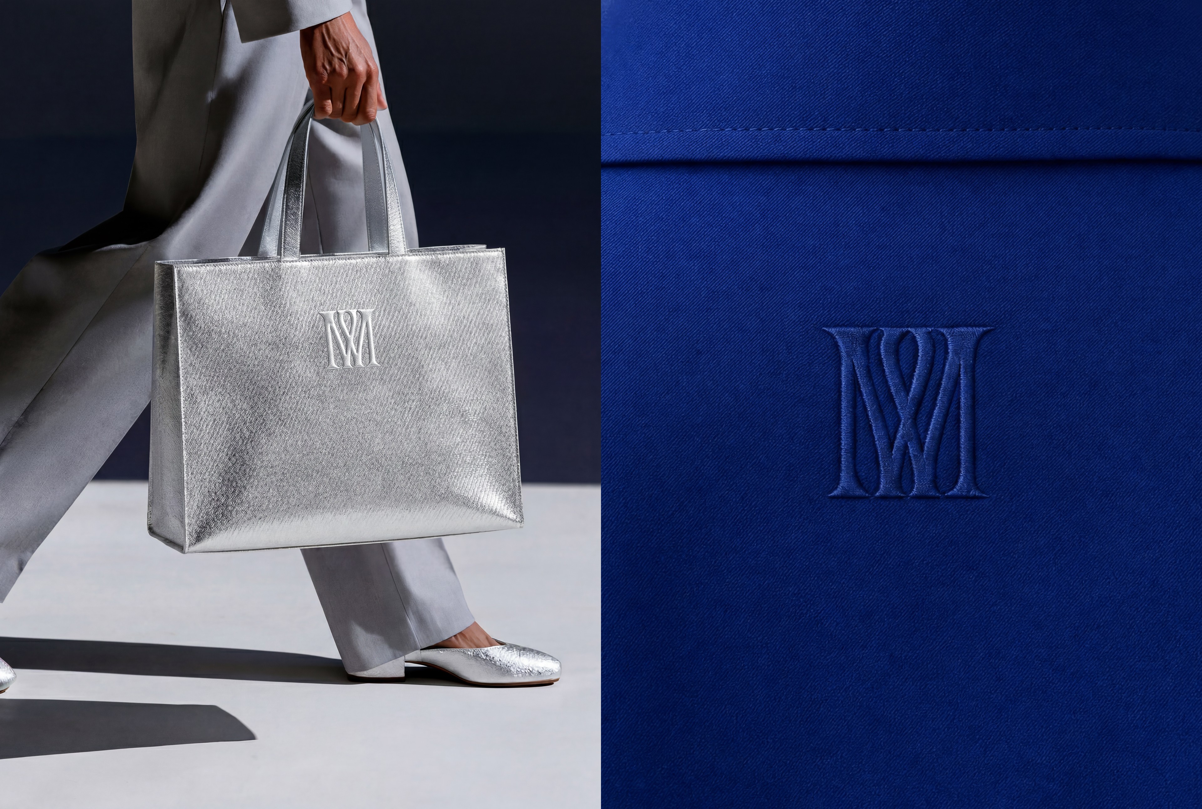
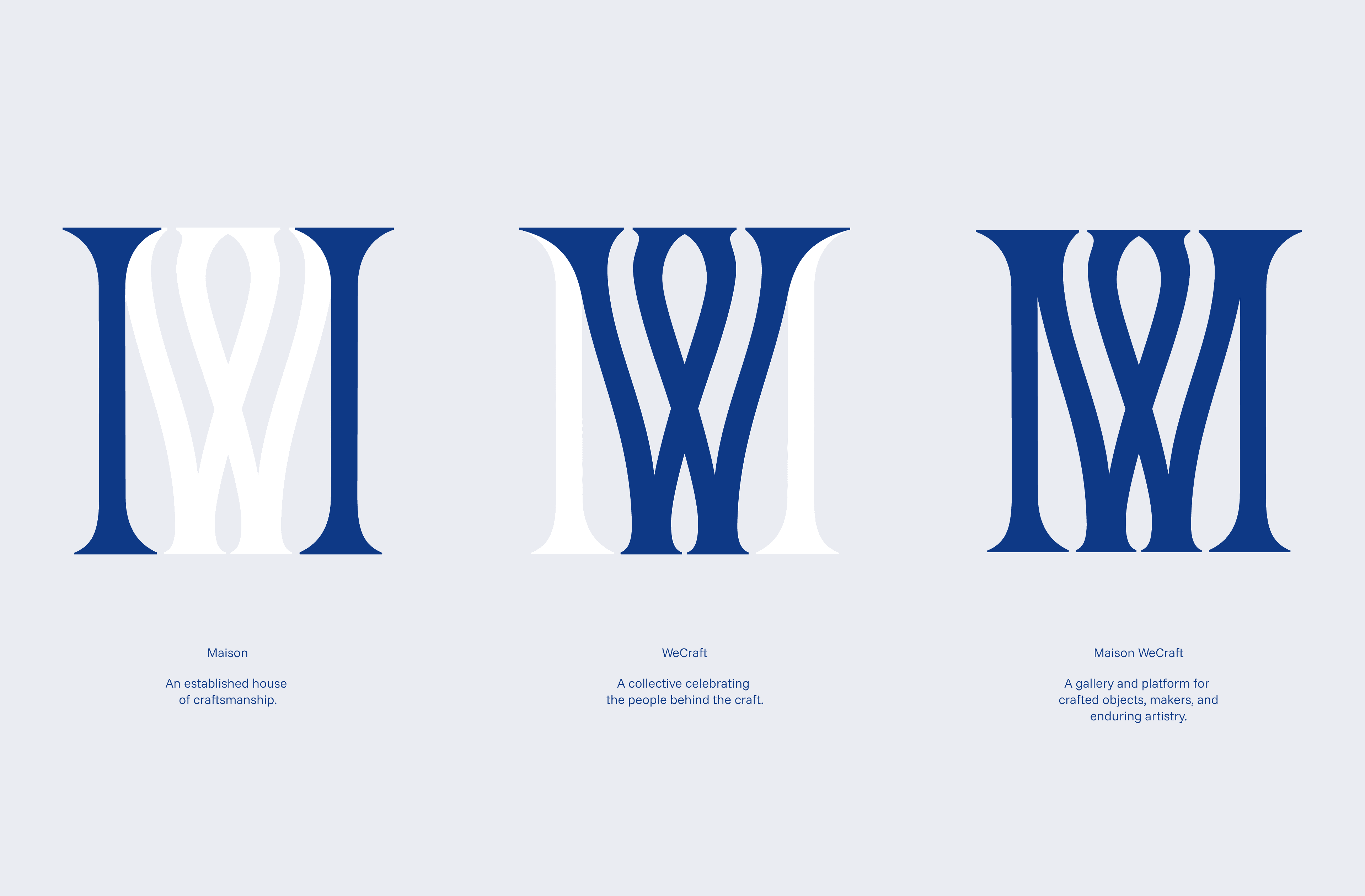
inspired by the brand's philosophy, the logo brings M and W together in a balanced, harmonious monogram, expressing the idea of a house devoted to craft, collaboration, and refined making.


the house of craft

conceived as a space for discovering contemporary heirlooms, maison wecraft brings together master artisans, material innovation, and refined living. each piece is valued not only for its function, but for the story, patience, and savoir-faire embedded in its making.

inspired by the brand's philosophy, the logo brings M and W together in a balanced, harmonious monogram, expressing the idea of a house devoted to craft, collaboration, and refined making.


a modern language for heritage

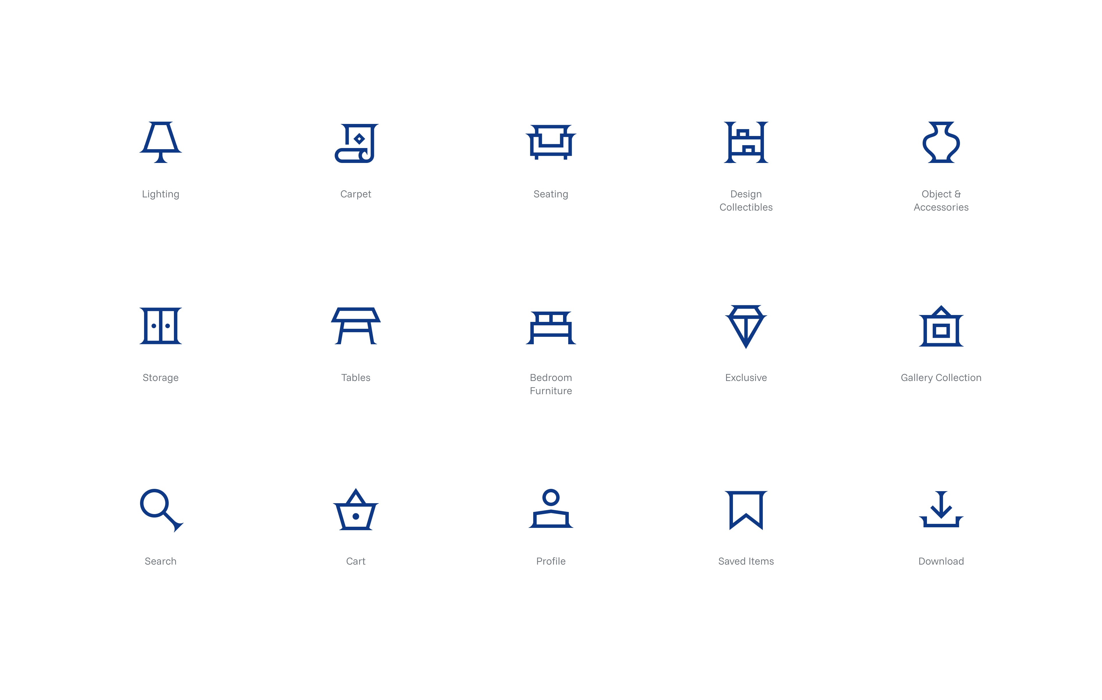
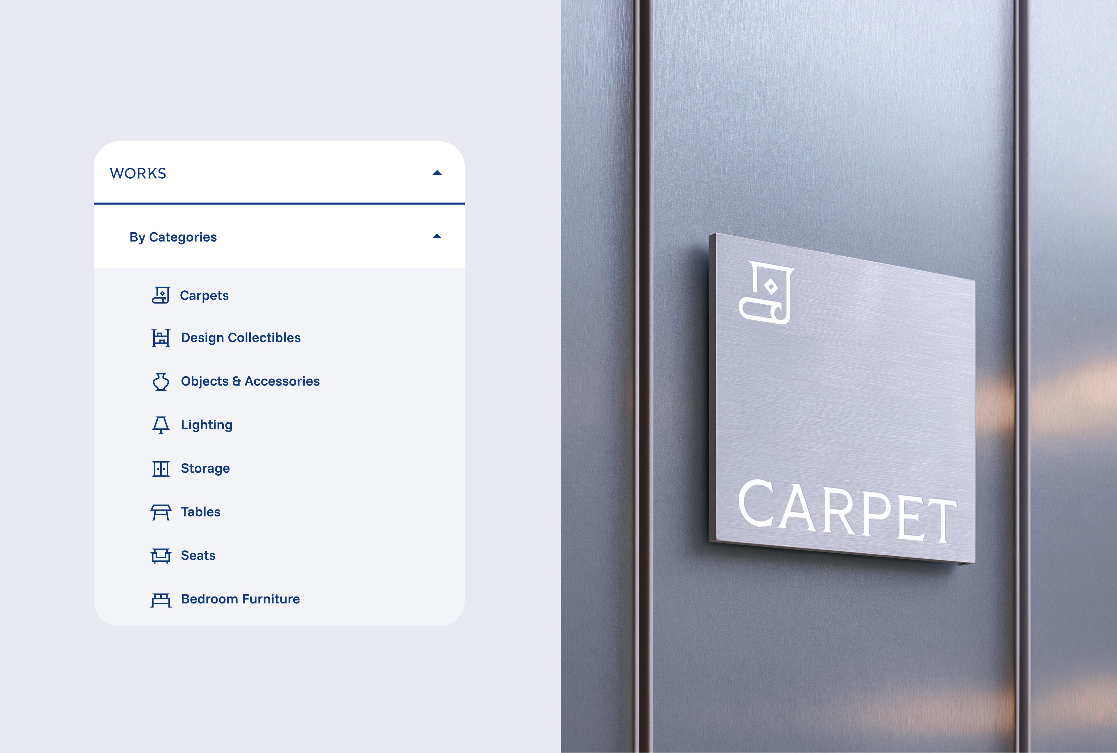
the identity was designed to reflect maison wecraft’s philosophy: timeless craftsmanship shaped for contemporary living.

the typography system pairs tiller with funnel sans to bridge heritage and contemporary precision. tiller, with its flared serifs and structural precision, brings a sense of history, artistry, and timelessness. in contrast, sunnel sans introduces clarity, restraint elegance, and modern functionality. together, the pairing articulates maison wecraft’s duality: rooted in tradition, yet designed for the world ahead.

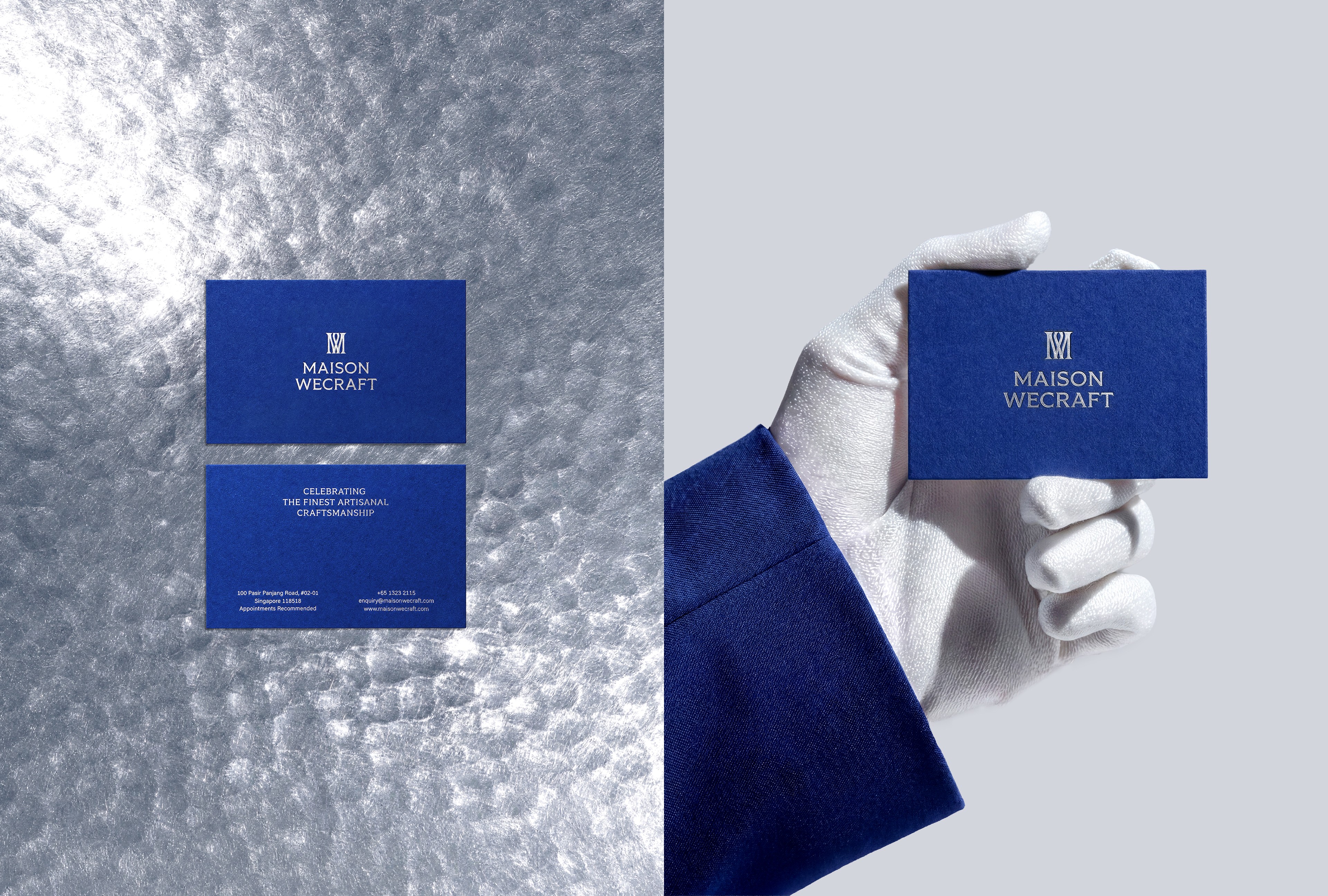
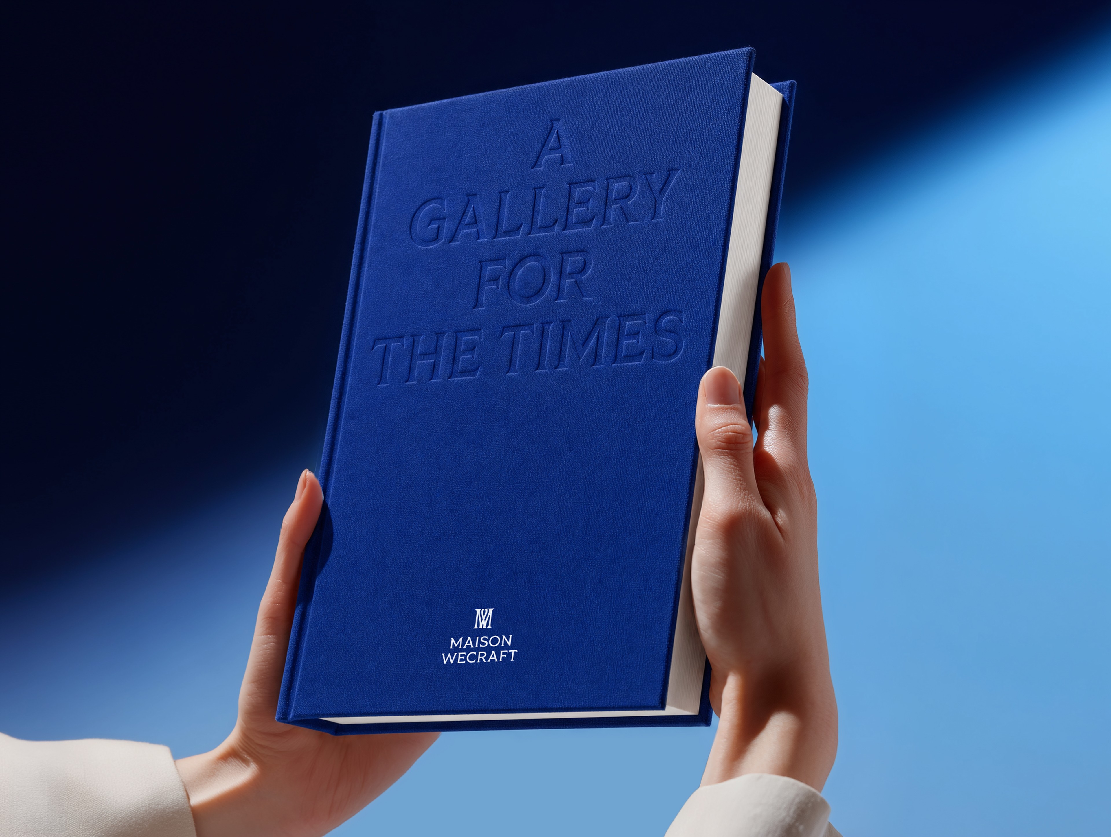
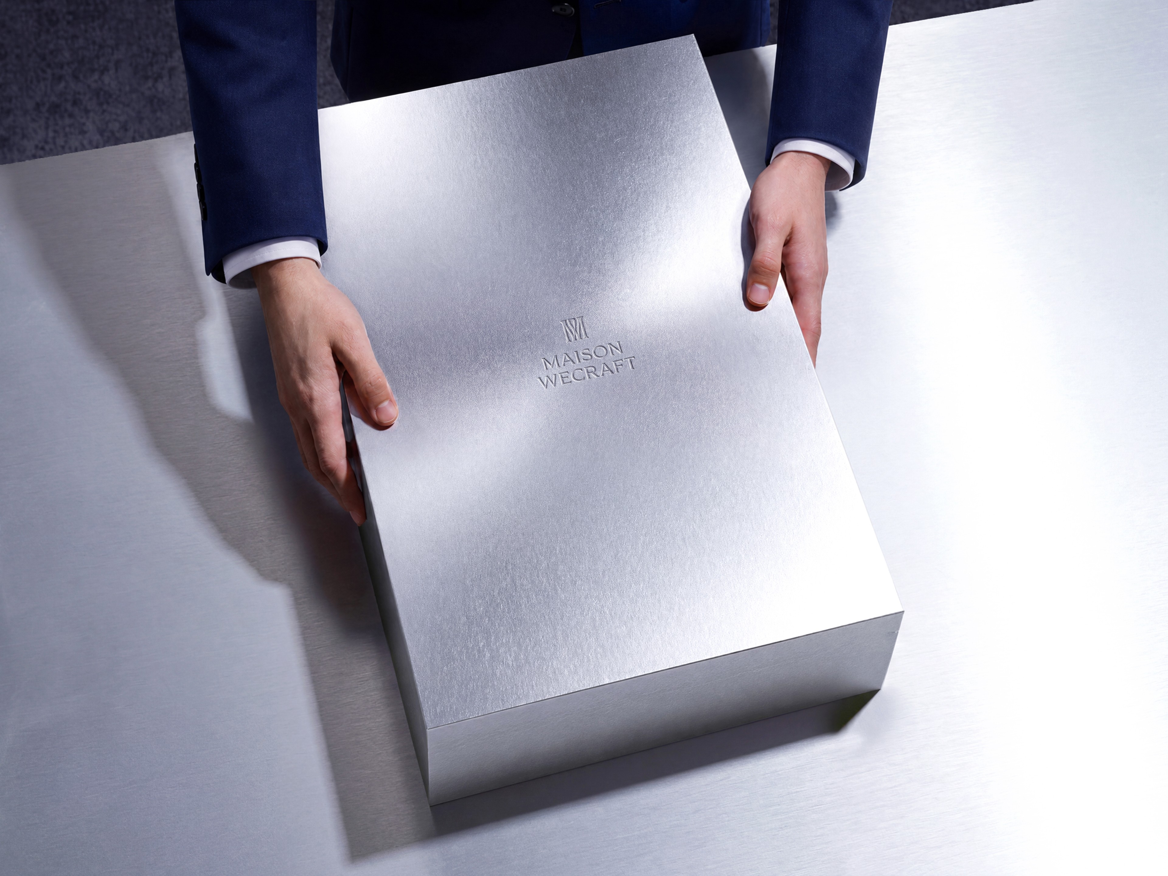
the palette combines indigo blue and palladium silver — a contrast between artisanal depth and modern edge. together, they create a visual language that feels crafted, quiet, and future-facing.


a modern language for heritage

the identity was designed to reflect maison wecraft’s philosophy: timeless craftsmanship shaped for contemporary living.

the typography system pairs tiller with funnel sans to bridge heritage and contemporary precision. tiller, with its flared serifs and structural precision, brings a sense of history, artistry, and timelessness. in contrast, sunnel sans introduces clarity, restraint elegance, and modern functionality. together, the pairing articulates maison wecraft’s duality: rooted in tradition, yet designed for the world ahead.

the palette combines indigo blue and palladium silver — a contrast between artisanal depth and modern edge. together, they create a visual language that feels crafted, quiet, and future-facing.


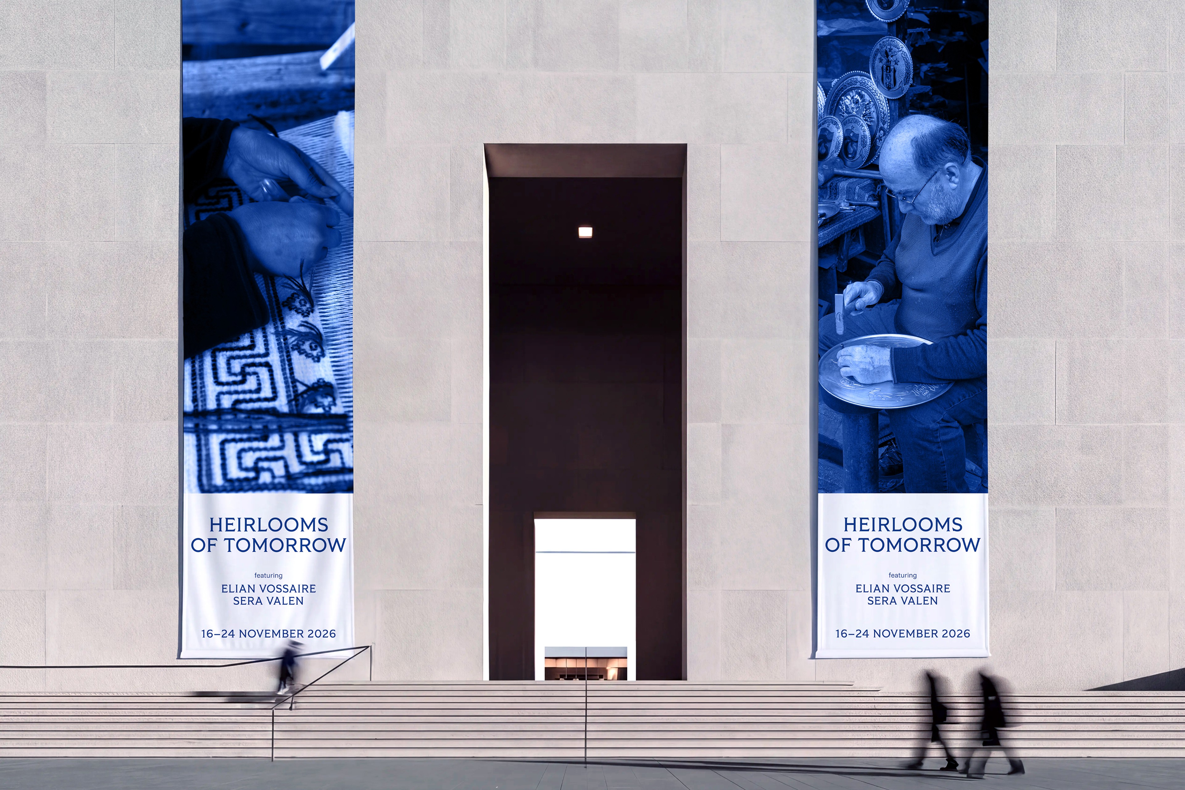
heirlooms of tomorrow

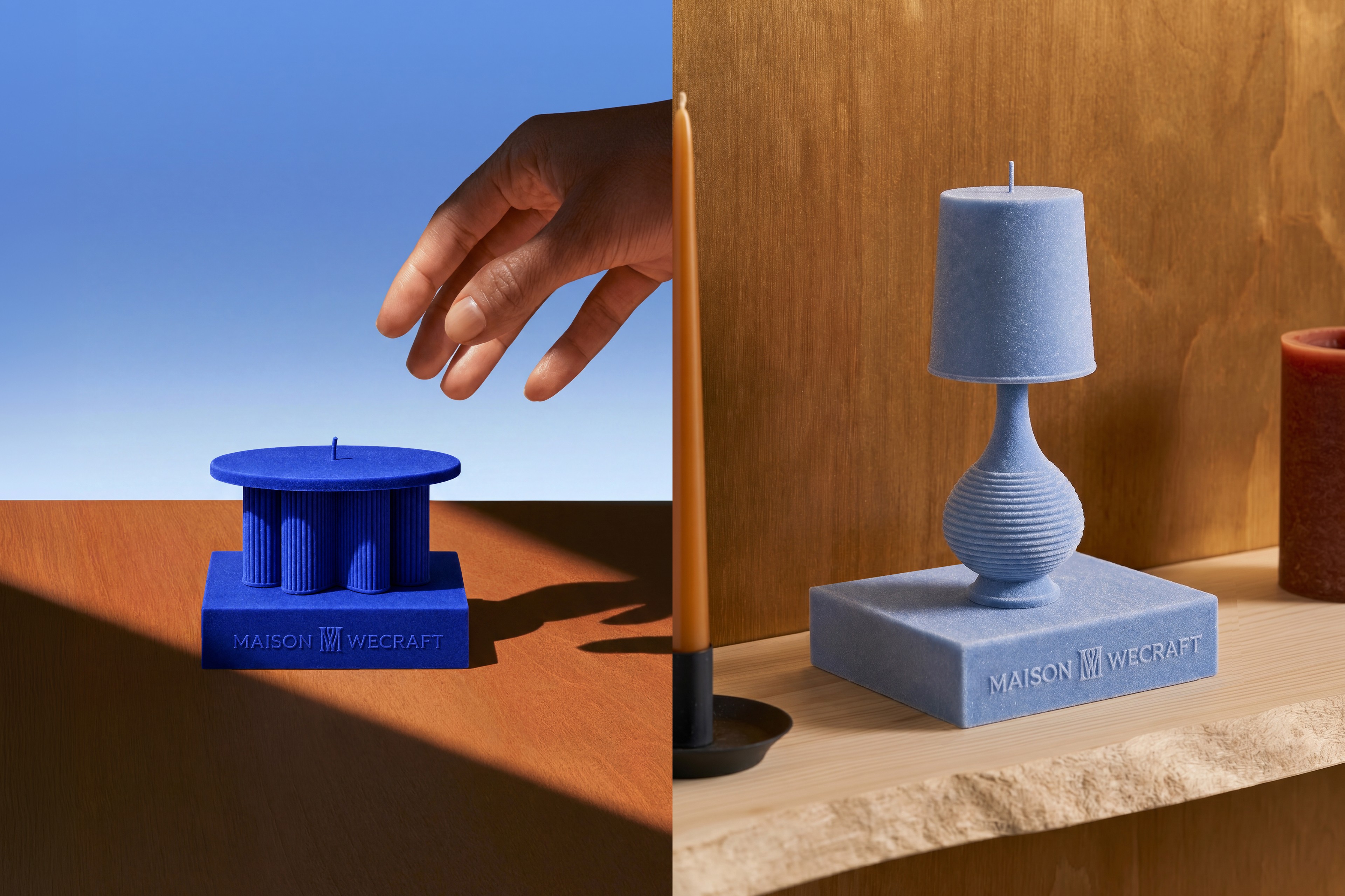
the result is an understated visual system with a refined sense of artisanal heritage. quiet yet distinctive, it reinforces maison wecraft’s premium positioning with elegance, restraint, and confidence.


heirlooms of tomorrow

the result is an understated visual system with a refined sense of artisanal heritage. quiet yet distinctive, it reinforces maison wecraft’s premium positioning with elegance, restraint, and confidence.


©2025 vy mai

©2026 vy mai. all rights reserved